Front Cover:
 I decided to choose this
magazine to do my textual analysis on as it is an unconventional looking
magazine and felt it would have not gained many readers compared to my good
example “The Griffin”.
I decided to choose this
magazine to do my textual analysis on as it is an unconventional looking
magazine and felt it would have not gained many readers compared to my good
example “The Griffin”.
Even though the title is position
at the top of the page, pretty much near the centre, like a conventional
magazine would, the rest of the front page is rather bare. The lack of information presented on the cover, doesn't really appeal to the audiences eye, as they do not know what
this school is about or what the purpose of this magazine is. In one aspect the
editor may have chose this on purpose, to intrigue their target market to pick
up the magazine to find out more, as the front cover does not give much away. However, the majority of readers prefer some idea as to what they are
reading and buying.
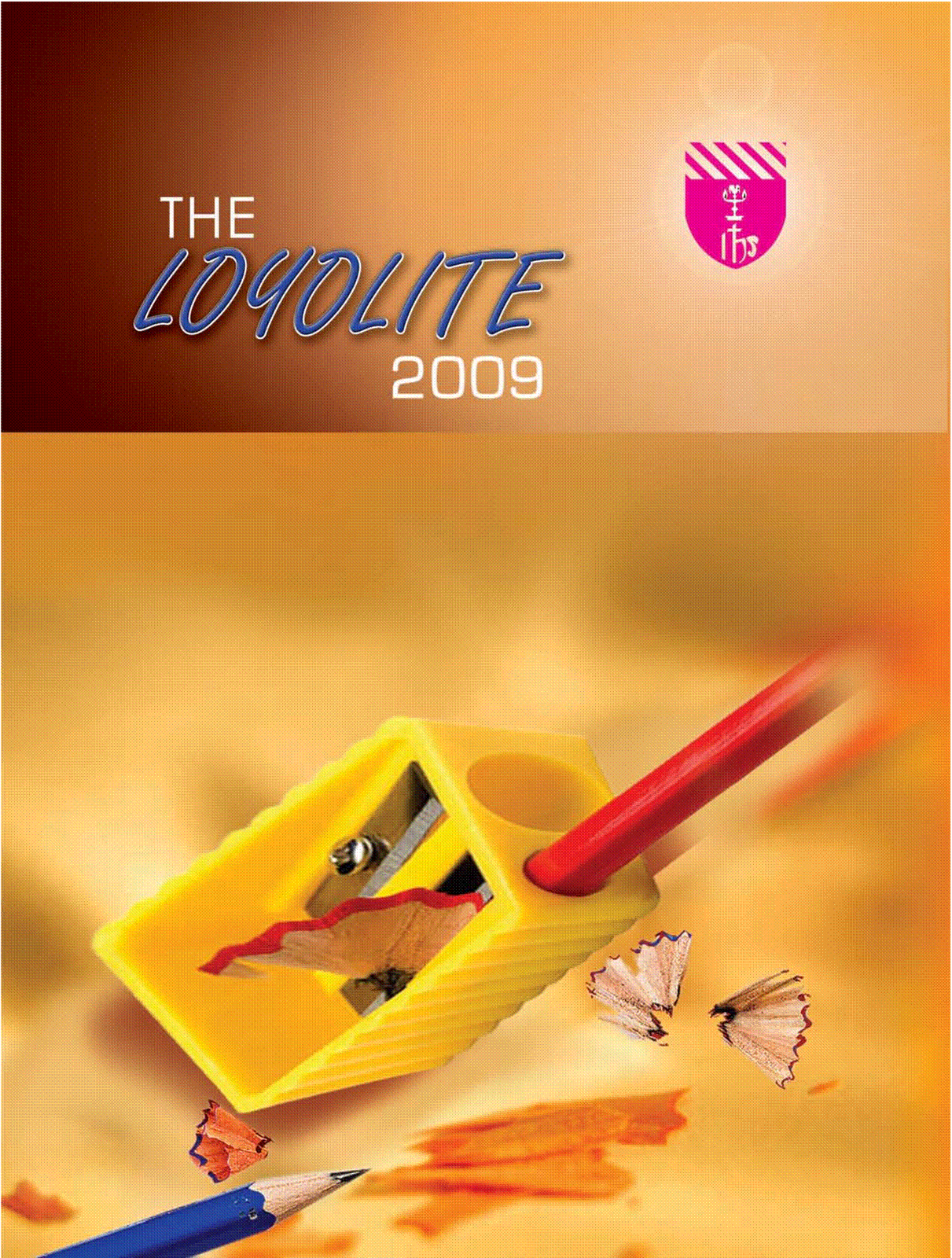
Although the picture is bright,
bold, clear picture of a giant sharpener, helps to symbolise this magazine is to
do with schools, the lack of information does not help the audience to understand what is inside or what it is about. Additionally, without a picture of a student
from the school, the audience are unable to see how the pupil feels about their
school and what the school has to offer.
With having no buzz word or
telling you the price of the magazine, the reader does not know what is
included in the magazine. By having a lot of space around the magazine
represents the idea this magazine is empty and doesn’t have much to offer in
it, for all the reader know, they only have a competition inside where you win a
sharpener as the winning prize!
Overall, I decided unlike the
magazine, I will include more than just a main image and a title to engage my
reader in the school magazine (and my music one later on) as I feel that with
just these two aspects on the page there is not enough wow factor for the
audience wanting to pick up and read this magazine. Lastly, if the shoes were
on the other foot and I was buying the new school magazine, I would prefer
something bright, bold and eye catching to take my interest and that is way I
will have my information displayed on my school magazine.
Contents Page:
The fact that this magazine
doesn't have a contents page is another reason why I don't think this
is the best example, as the readers are unable to engage in the overall product
if they have no idea what is in it. Without the contents page the reader could
get easily confused and put off by not knowing what is inside this magazine. Due
to the lack of information on the front cover and the contents
page, it will make the audience feel less inclined to read it, as they
don't know what page they need to look at for certain information.
No comments:
Post a Comment