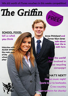
 This particular magazine called
“The Griffin” I thought was one of the best school magazines published so far, as it had a clear conventional layout, ensuring the audience can read what is
on the front cover to engage them in the rest of the magazine.
This particular magazine called
“The Griffin” I thought was one of the best school magazines published so far, as it had a clear conventional layout, ensuring the audience can read what is
on the front cover to engage them in the rest of the magazine.
The fact that the background is
plain with no distractions of clashing font colours, help the picture stand out
instead of getting lost in a mish mash of colours. By having the font colours, such as purple and black, contrast with the light grey background and therefore
the font is easy on the audience’s eye to read. This overall has a professional
look to the magazine making it more aesthetically appealing to their target
market.
By having the main image of the
magazine placed in the centre of the page, helps to draw attention of the
reader to the magazine, as well as having enough room to write the title of the
magazine, sell lines, logo, buzz word etc. The title is positioned near the top of the page (where you would expect to find on most magazines) as it is one of
the first thing the reader notices. The title is also emboldened and in italics
to emphasise its importance and for those who know of the magazine can look out
for the styled title. Although the use the title is a serif font and main image
conveys a formal feel to the magazine, the rest of the cover lines seem to be
in a sans serif font. This implies that the magazine is for people who are
at a mature enough age to read it, but not too formal that their target market would not be interested to read what is inside.
By having a buzz word
positioned around the outside of the magazine, a reader would glace upon this
information first and want to pick it up due to the free promotional offer.
Especially if this magazine is targeted at the teenage pupils who go that
school, the competition of recieving a £15 iTunes voucher would appeal, as it is a good prize to win. Furthermore, the use of the logo at the bottom left hand
side of the magazine represents the school, again making it seem more
professional and appealing to their target audience.

Contents Page:
Another reason why I believe
this is a good conventional magazine is because it has carried on the colour
scheme from the front page onto the contents page. By keeping continuity
throughout, shows the magazine has a specific house style that they keep with each
issue, making the magazine easy on the eye and looking more professional.
The use of the big, bold, black
font helps to clearly make out what is on each page of the magazine instead of having
to squint to read small numbers and having to follow a confusing layout where
the numbers are set out all over the place. By having it in a list layout, reinforces
to the reader they must start at the top and work their way down to find out
the rest of the information of the magazine. Furthermore, due to the
magazine having a rather plain, but effective layout, the use of picture help
to attract the readers attention to the cover line story, so they know which ones are the “hot goss” pages of the magazines, as well as helping to understand
what the main stories are about. By having a brief summary of the “Top Story
This Month” helps to engage the reader to a certain extent without giving all
the information away all at once, leaving the reader wanting to find out more. Also, by having both pictures on either side of the page, doesn’t make one side look cramped and the other side completely empty, or even lopsided. By
including the pictures in the first place, again, helps to grabs the audience’s
attention by leaving no blank spaces and making the page look more
aesthetically pleasing.
No comments:
Post a Comment